 View Prototype
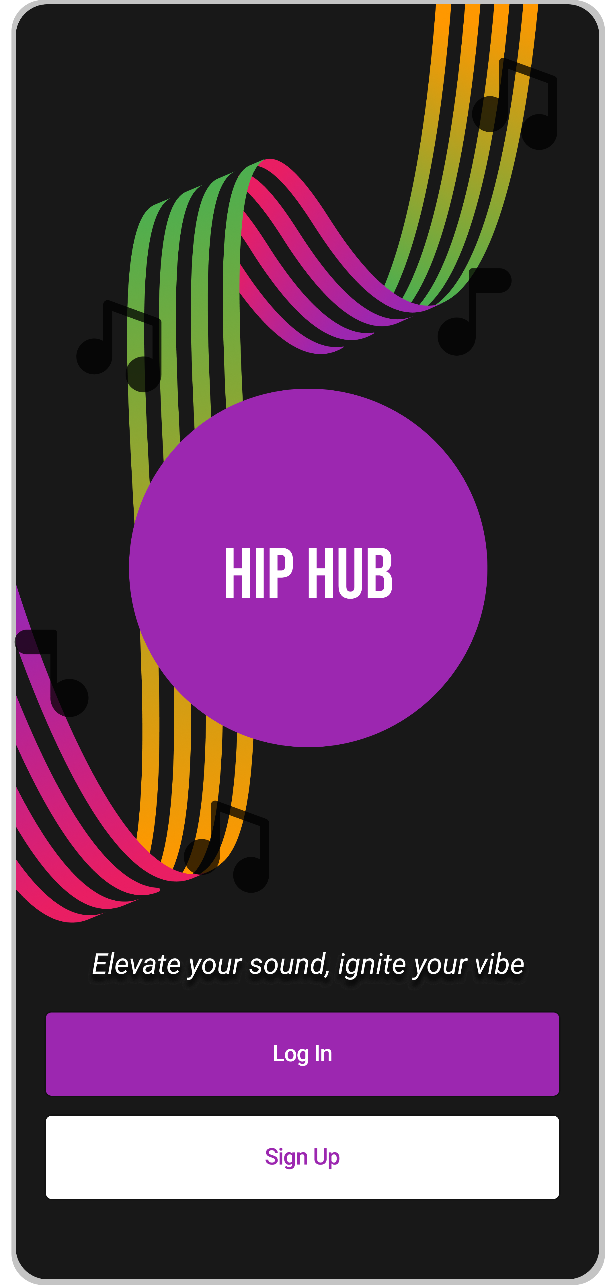
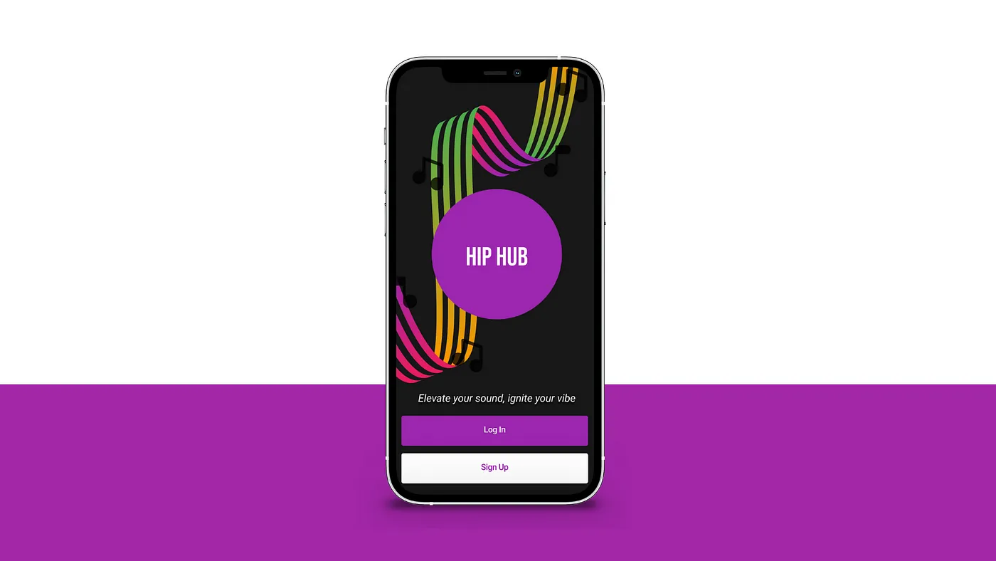
Hip Hub is a startup that launched a media product as a freemium model two years ago. Since then, the product has become well-received and has accumulated a healthy base of free users. Now, the company is in need of an experience that will allow users to subscribe and pay a monthly fee.
To allow users to upgrade to a premium subscription, I designed multiple opportunities to do so. However, th is only as good as the users should even subscribe in the first place. Within these opportunities I also created prominent calls to action and gave users compelling reasons to upgrade their free plan.
Independent
End-to-end design
3 months
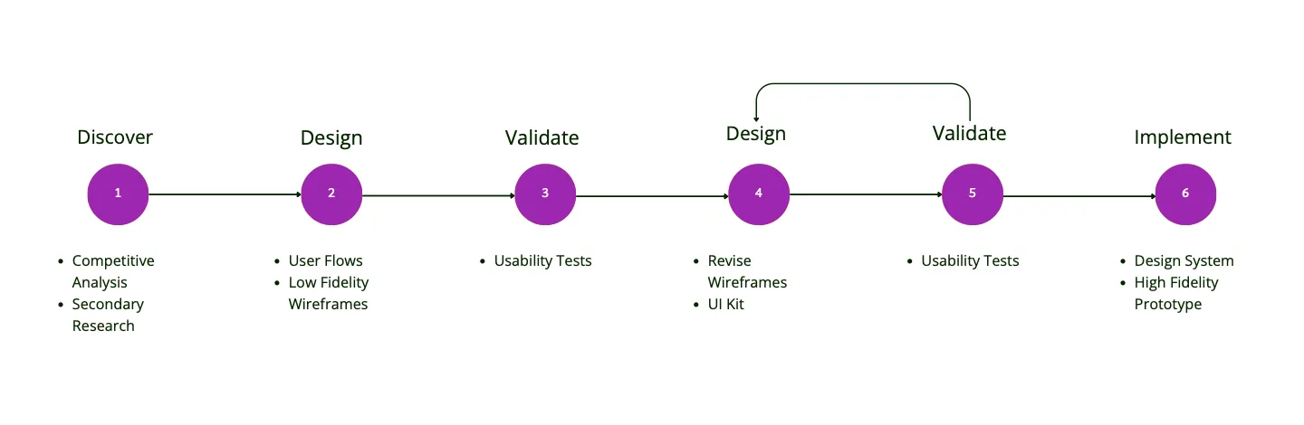
Initial research focused on analyzing industry competitors’ premium subscription sign-up flows and conducting secondary research to find solutions to compel Hip Hub’s target audience of tech-savvy, budget-conscious, 18–24 year old users to subscribe to a paid media product.
First, I analyzed Medium, Soundcloud, and Spotify’s subscription sign-up flows and laid out what I liked and disliked about them which helped inform action items I would incorporate into Hip Hub’s flows. Here is the analysis:
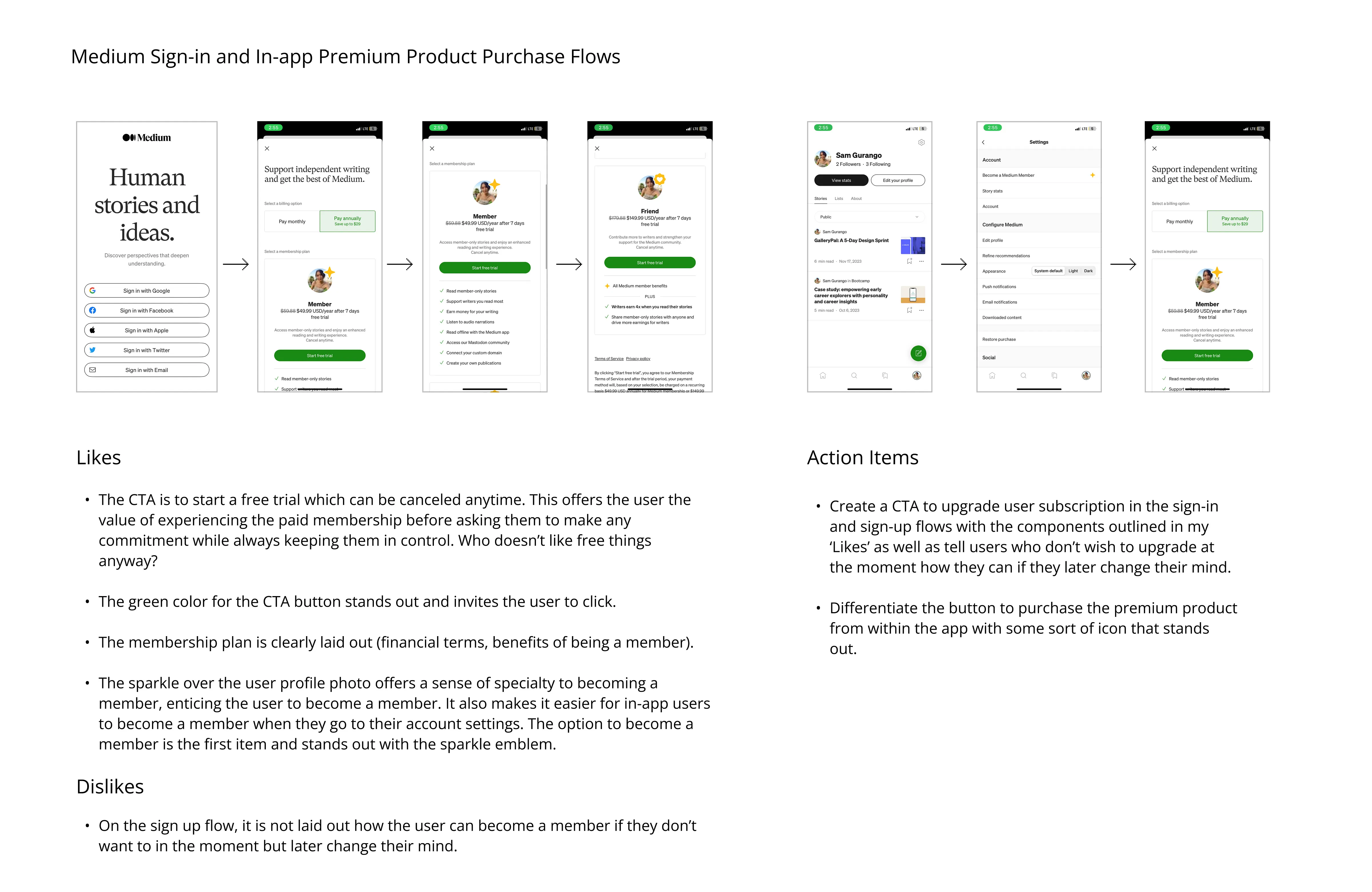
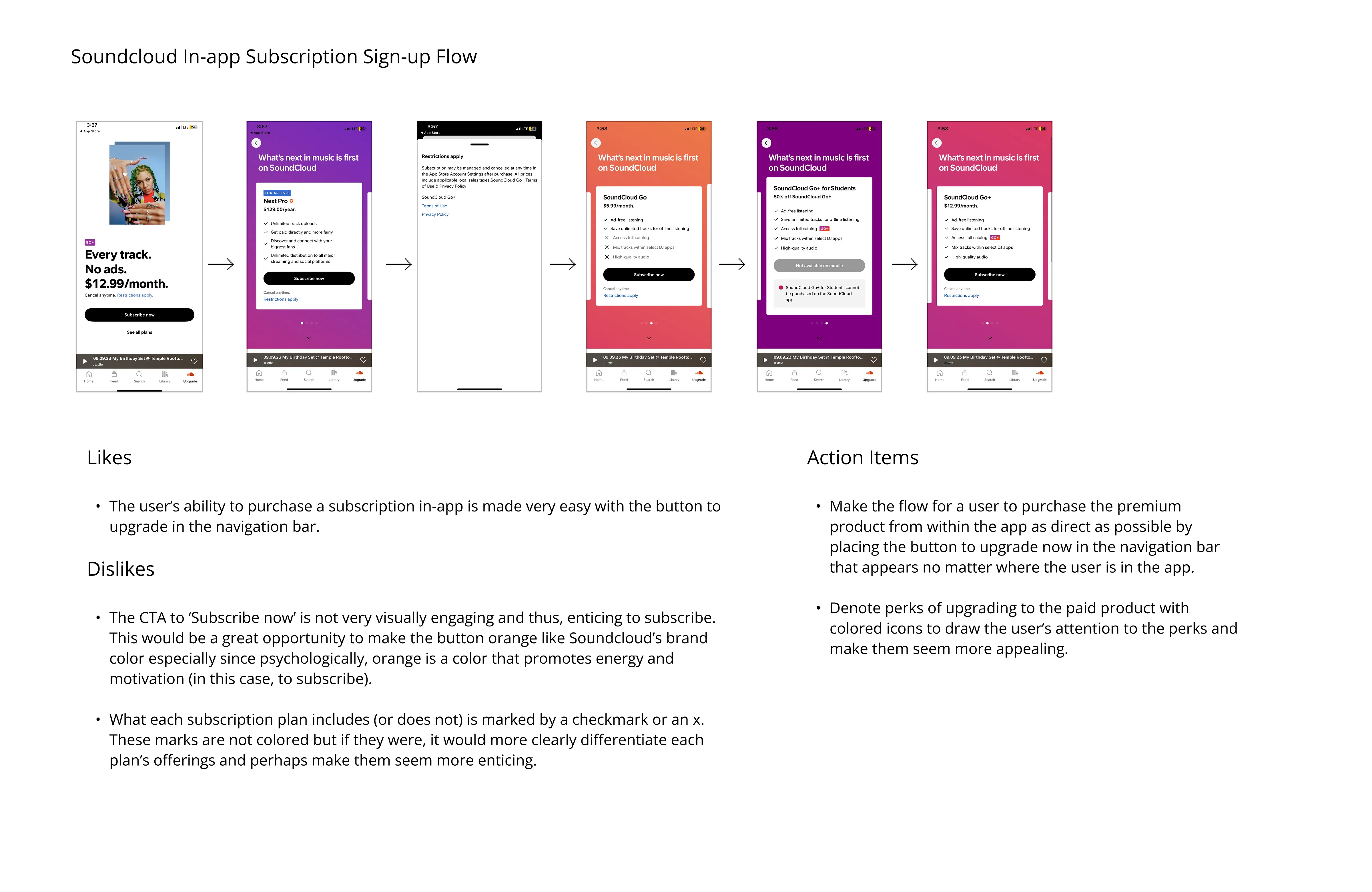
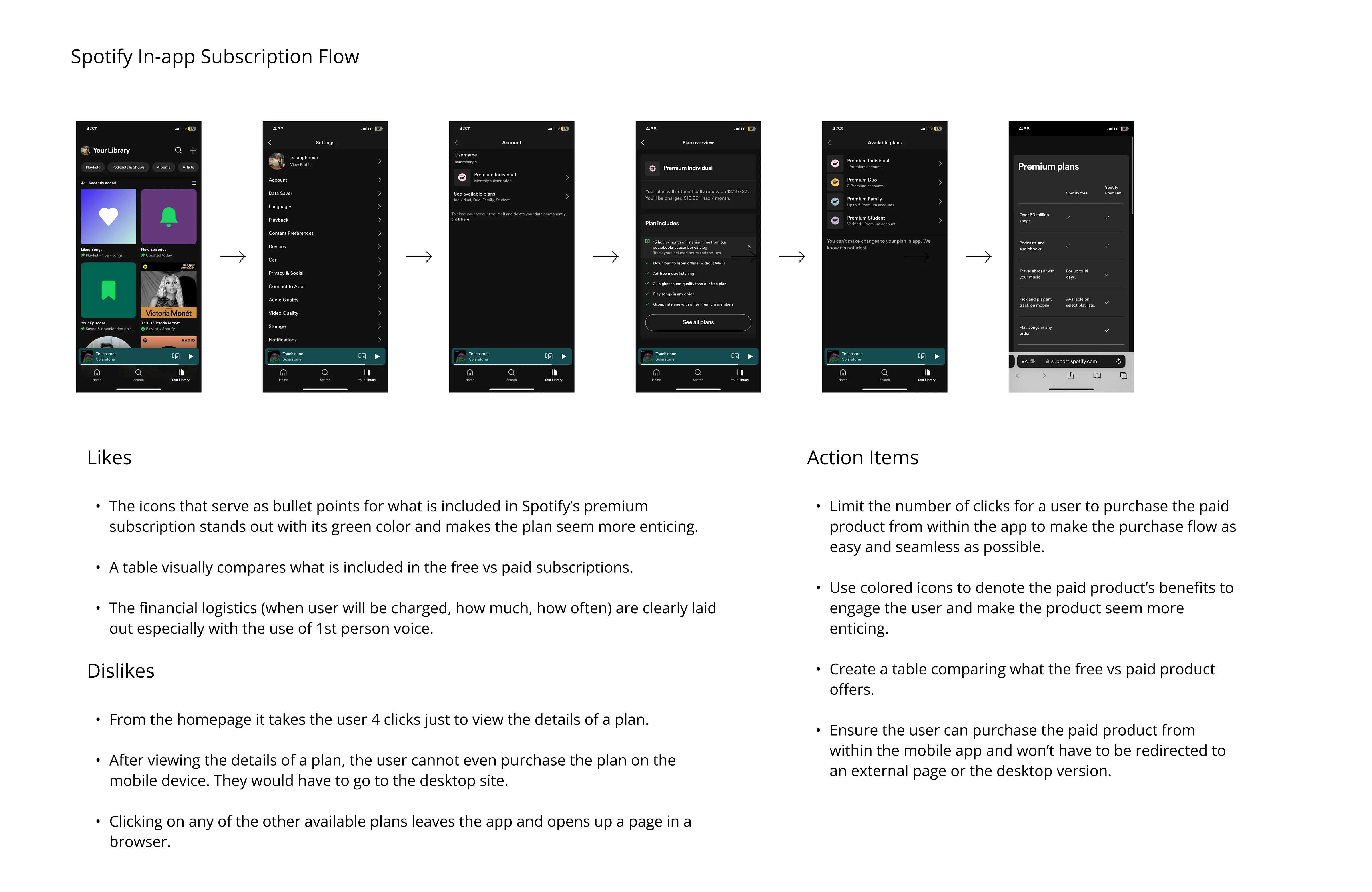
After performing a competitive analysis, I conducted secondary research to discover solutions to compel Hip Hub’s target audience of tech-savvy, budget conscious, 18–24 year olds (AKA Gen Z’s) to subscribe to a paid product. I discovered factors motivating Gen Z folks to subscribe to a paid product from most to least important are: price, trust in brand, ease of use, quality of sound, ease of discovering new music, personalization, availability of exclusive music, and flexible plans.
Then, using Miro, I outlined user flows for opportunities for users to upgrade their free plan to a paid subscription:
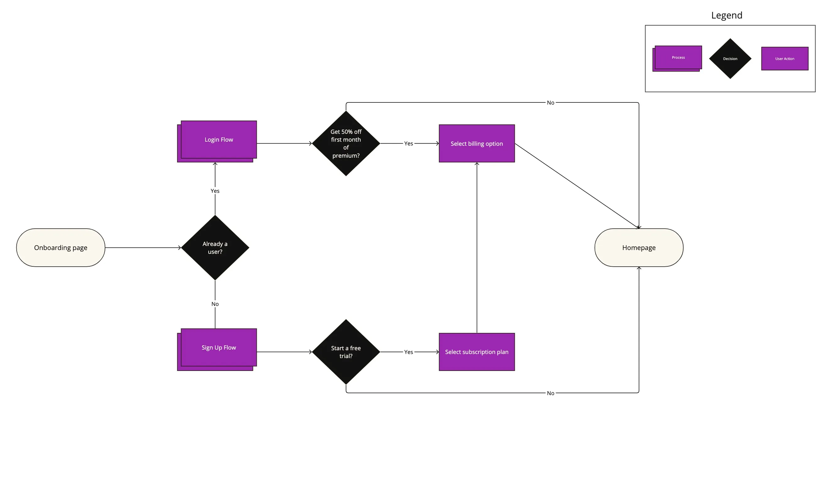
User Flow #1: Upgrading to a premium subscription while signing up or logging in
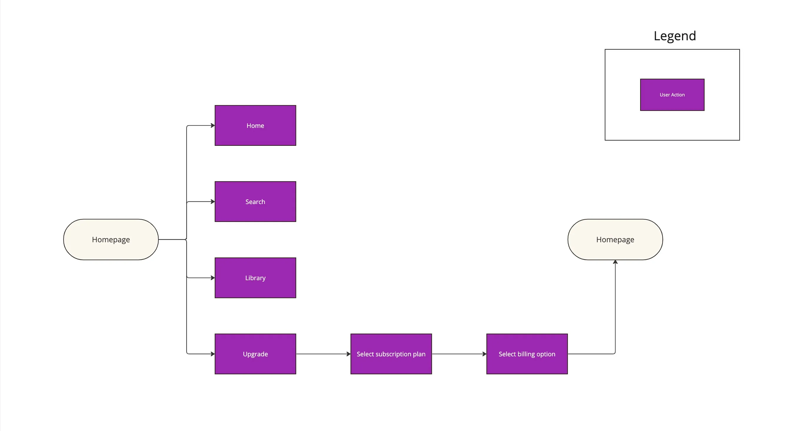
User Flow #2: Upgrading to a premium subscription from within the app as a new or returning user
After I established user flows, I used Figma to create low fidelity wireframes as a way to brainstorm the respective user flow steps.
Here they are:
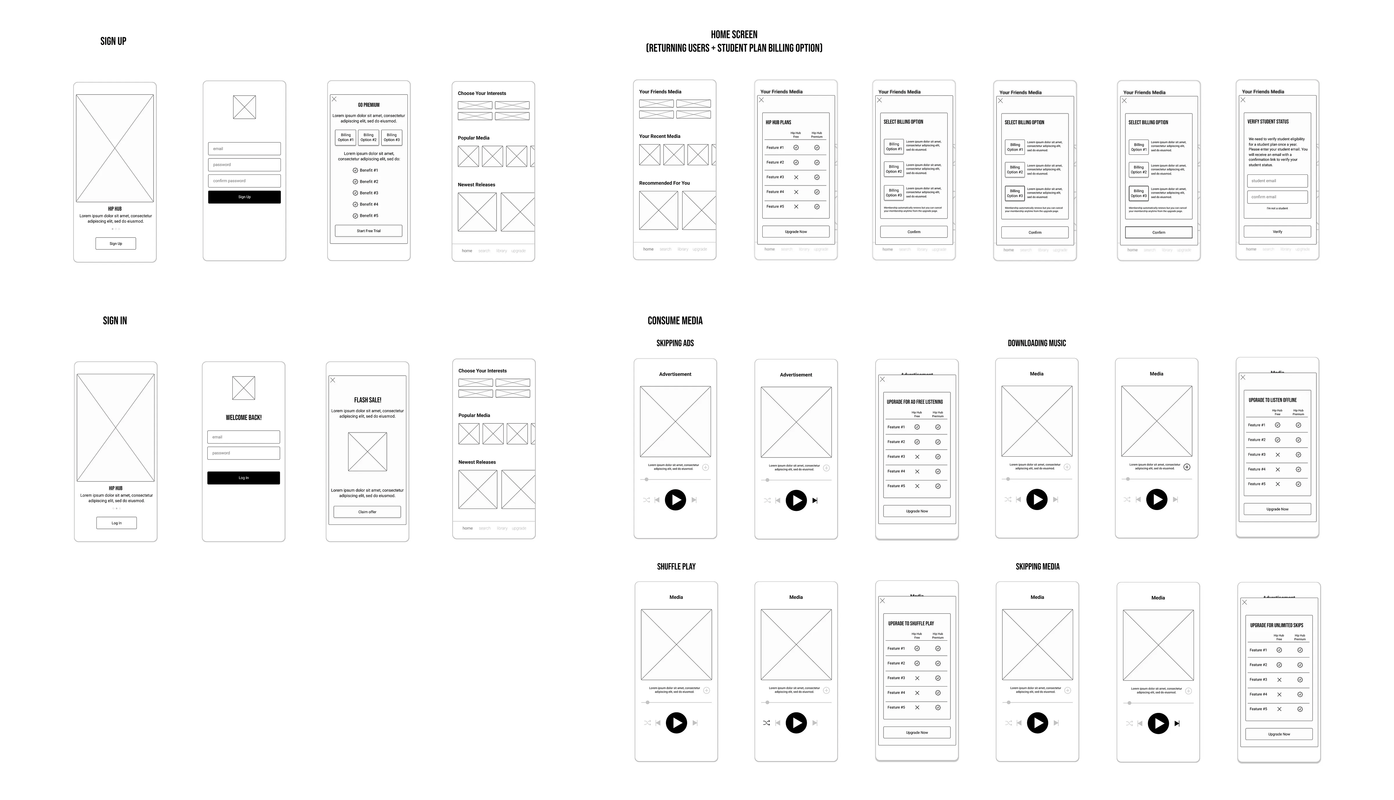
Low fidelity wireframes V1.1
After creating the low fidelity wireframes, I turned them into a prototype in Figma. Then, I conducted usability tests to discover aspects of Hip Hub’s design that can be improved to better influence users to upgrade their subscription as well as further ease the upgrade process. Here are the main insights and proposed solutions from the first round of tests:
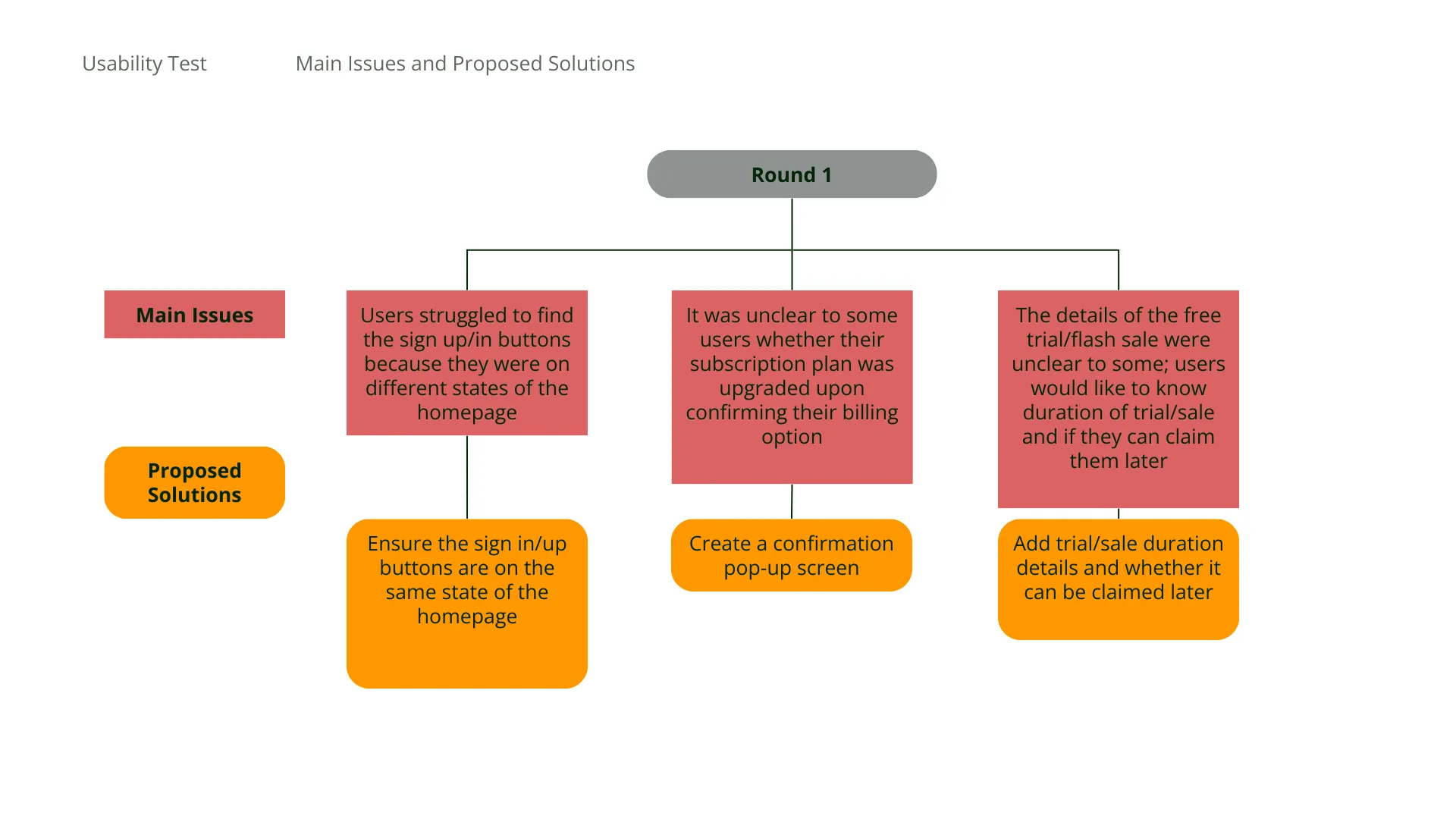
Based on insights from the first round of tests, I tweaked the design in response to issues users were experiencing that were critical to being able and compelled to subscribe to a paid subscription.
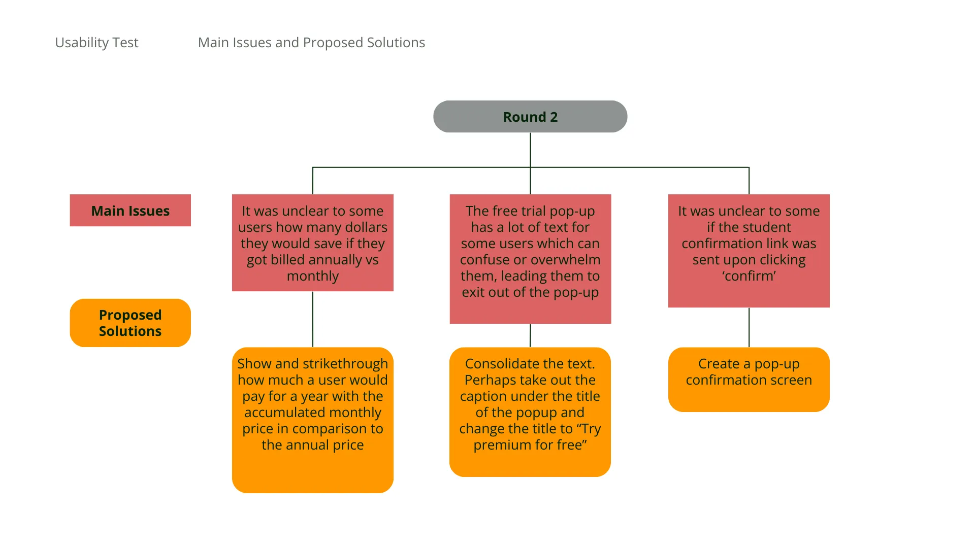
After these changes were made, I deployed a second round of usability tests to further solidify screen layouts before implementing visual aspects of the design. Here are the main issues and proposed solutions from this round:
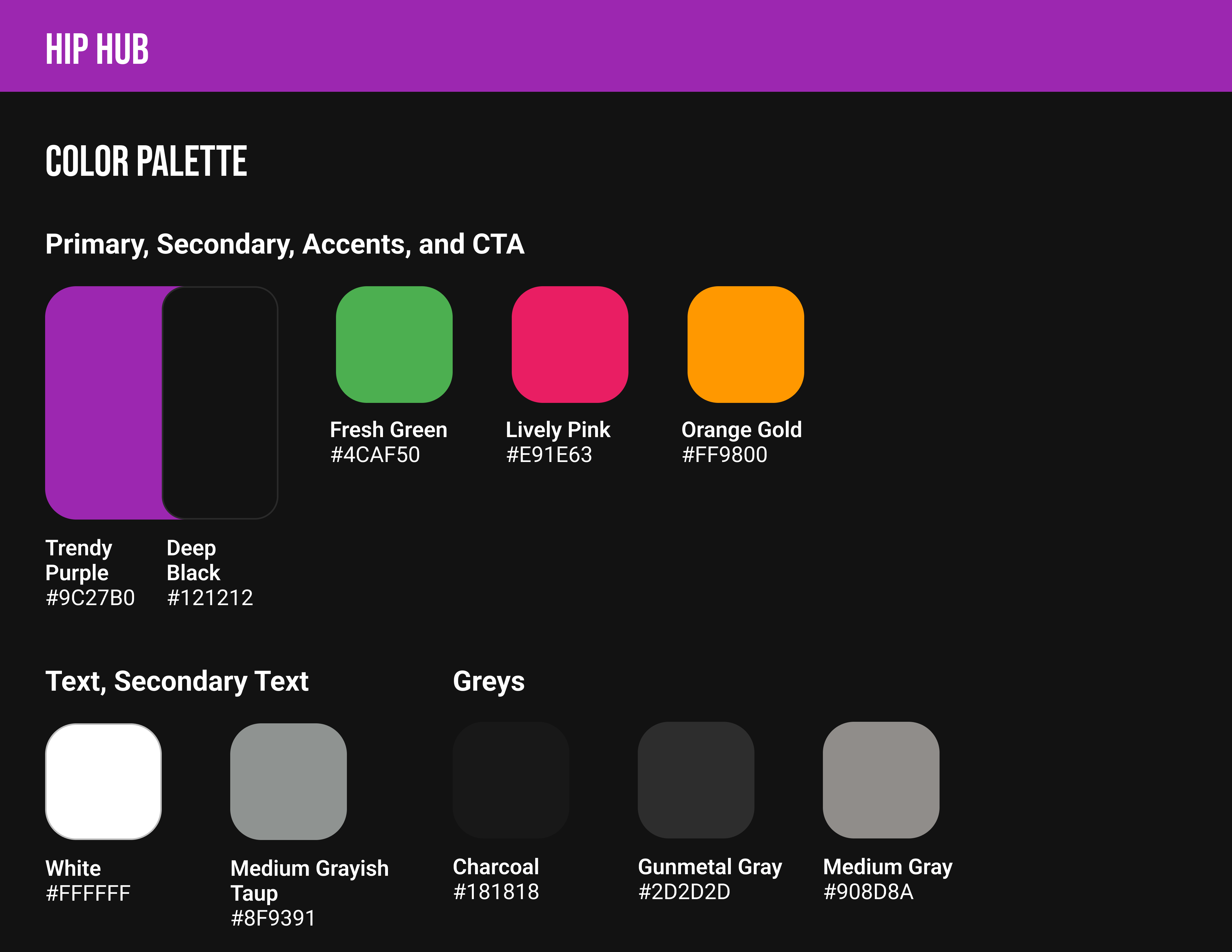
After refining the functionality of Hip Hub’s design, I createbetter establish branding that aligns with Hip Hub’s personality of being bold, hip, and smart as well as to promote user delight and a sense of cohesiveness throughout the app.
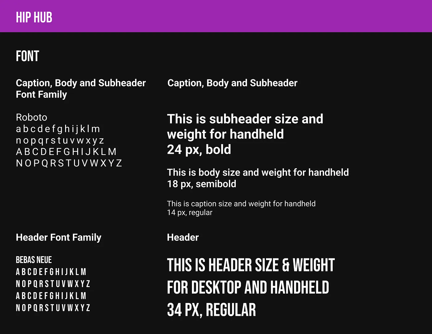
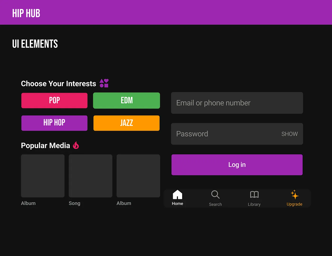
After implementing the design system, here is the final solution:
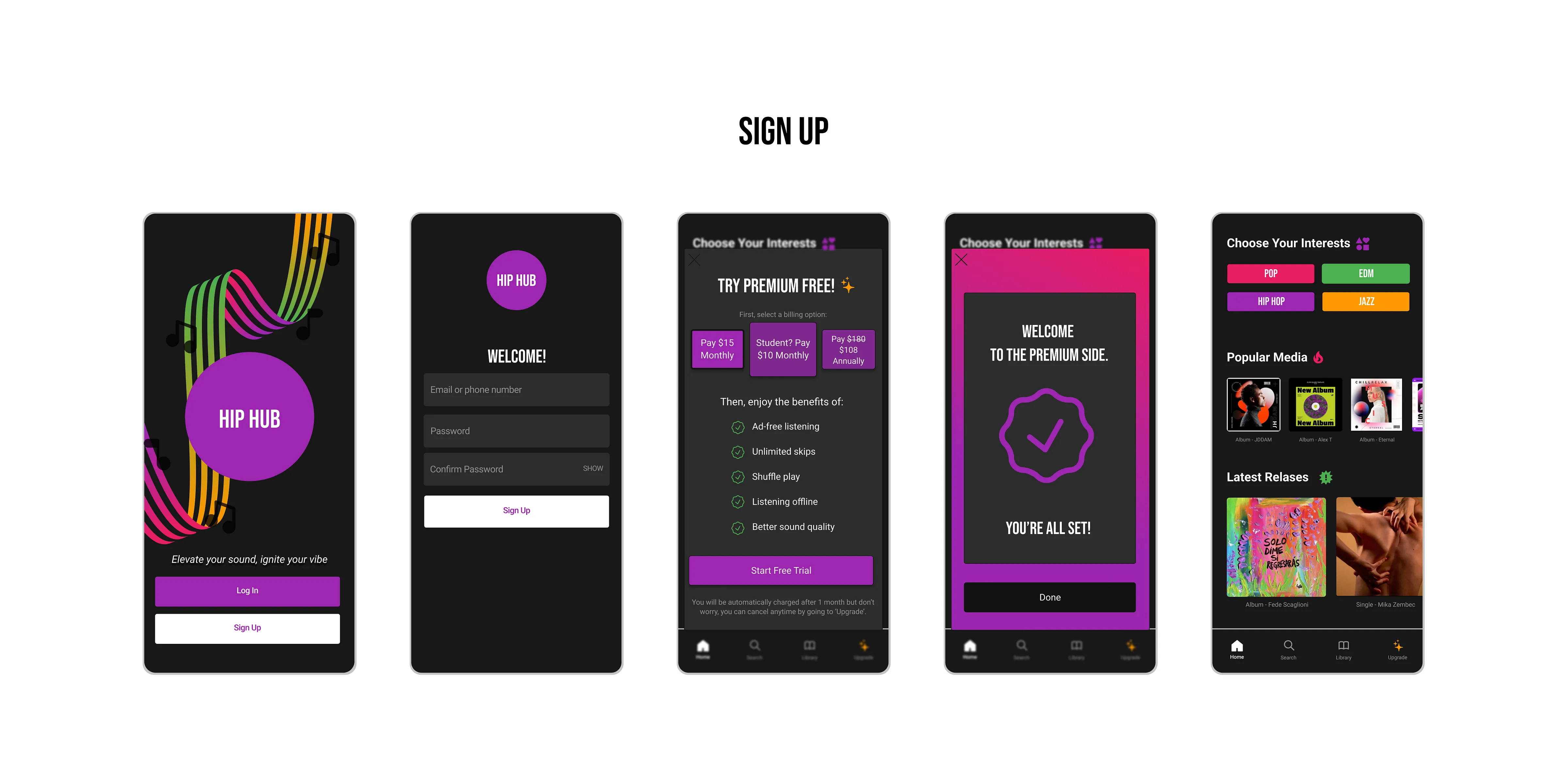
New users who are signing up are offered free Hip Hub premium trials and flexible billing options to choose from.
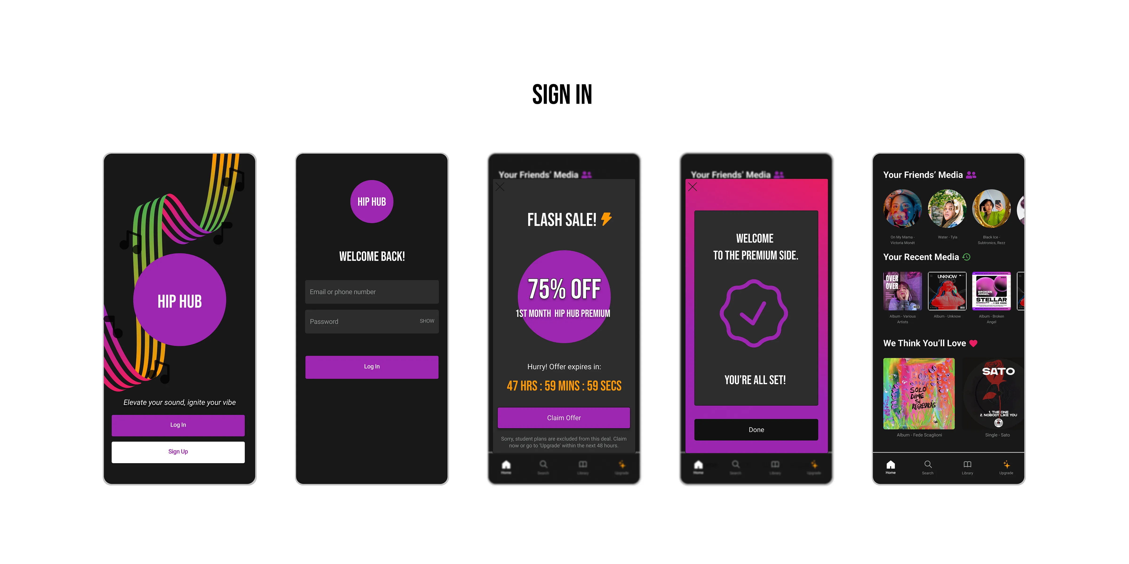
Returning freemium users logging in are offered a flash sale of 75% off the 1st month of Hip Hub premium.
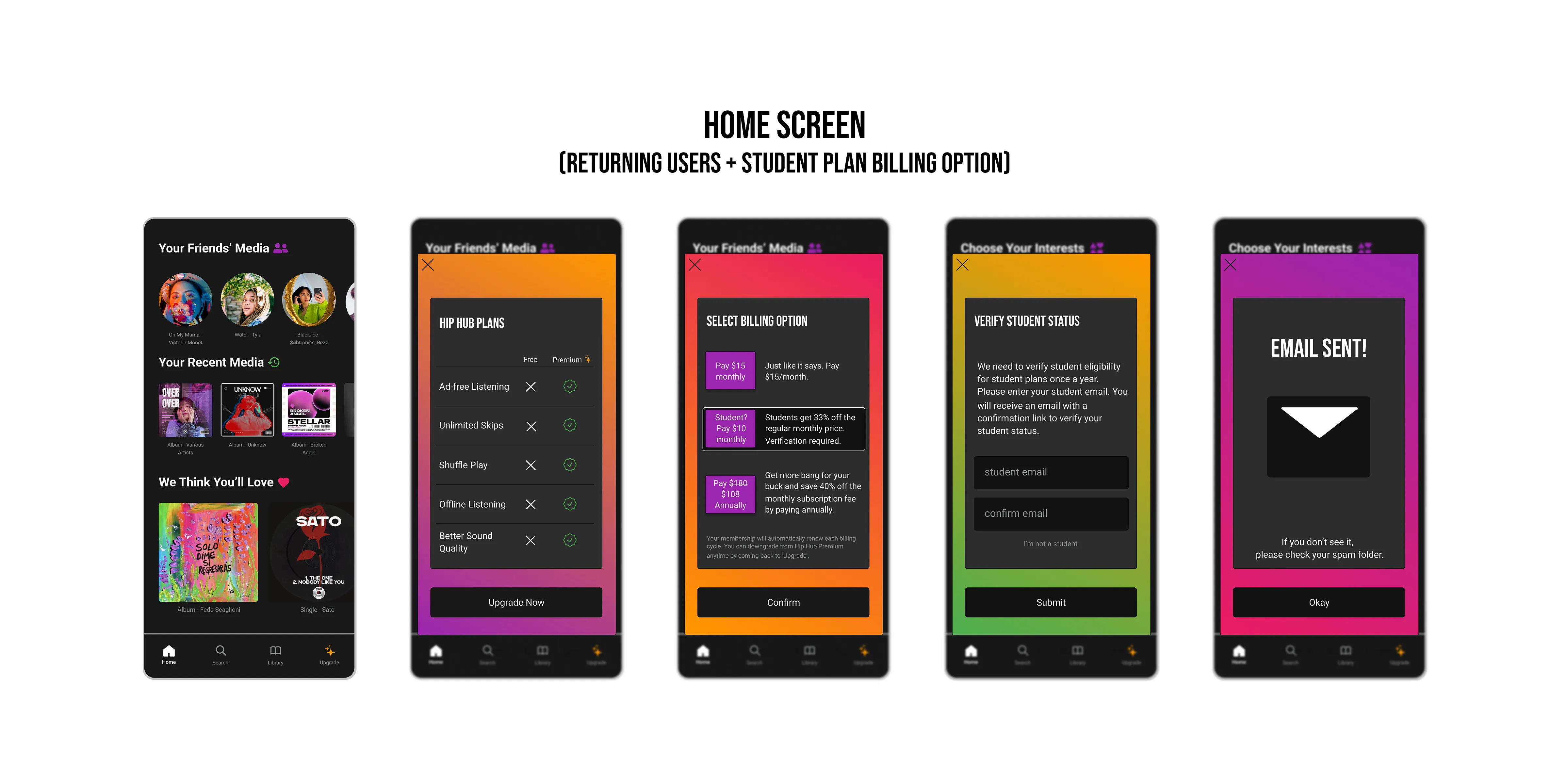
Users can upgrade to Hip Hub premium from within the app by going to ‘Upgrade.’ A table visually compares the benefits of the free vs paid plans. For the student plan, users need to verify their student status.
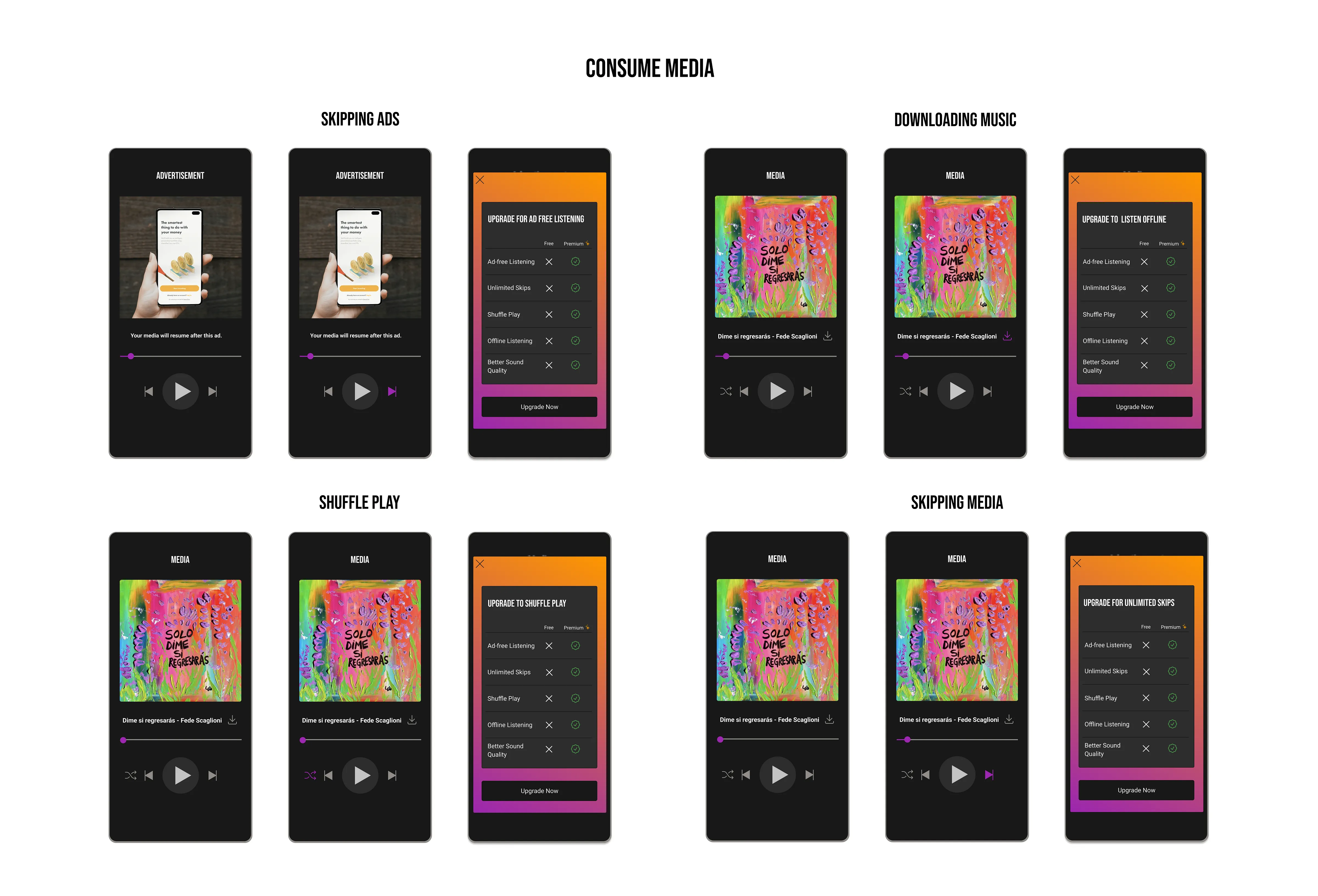
When freemium users try to skip ads, download media, shuffle pay, and/or skip media, they are prompted to upgrade their membership.
During prototype testing,
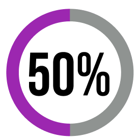
of users converted and chose to start their free trial.
Overall, my solution effectively address the challenge faced by Hip Hub in transitioning to a subscription-based model by optimizing the user experience, tailoring offerings to the target audience, and providing incentives for conversion while maintaining transparency and flexibility.
If and when time were to permit, here are some next steps I would take to improve my solution:
Want to see Hip Hub in action?
Test the prototype here!